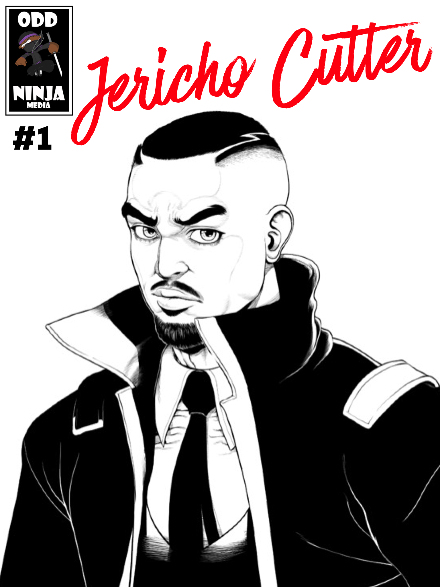
Jericho Cover Art
Designing the cover of Issue #1 is possibly the most important piece of the whole process. It is your first impression and can make or break your launch. For Jericho Cutter #1 we wanted to take an aesthetic approach rather than a traditional comic book style and create something that could stand alone as a work of art. In our humble opinion we believe we succeeded in that mission but the feedback from readers has been mostly positive as well.
It took some time to develop the right look for the cover and it went through several iterations before the final masterpiece was crafted. Here are some concepts, drafts, sketches and variants to give you a peek into the creative process.
Mockup #1 Draft
Mockup #1 Final
Cover Concept #1
Jericho Cutter “Preview” Cover
“Explicit Content” Promotional Cover
Variant Cover #1
Variant Cover #2
Variant Cover #3
“Chamber of Roes” Variant


